
 Teaching the world of molecules to relative newcomers is challenging because it’s an invisible world with ‘rules’ that don’t always have a 1-to-1 correspondence with the macroscopic world (looking at you, hydrophobicity). A second issue is that while the molecules themselves are concrete things, we discuss them using their labels–A or adenine or glucose or ‘protein’. Too often, students end up with vague notions (or none at all) about these entities. Given that everything in the cell is made of and run by molecules, student success in thinking and understanding is critically dependent on what they’re picturing as molecules. I think care in and improvements of molecule display can go a long way towards making their lives easier and their understandings richer.
When we ask students to ‘solve problems’ in molecular biology, or even simply to ‘understand’ at a deep level how any of the machines and processes in a cell ‘work’, we depend on the pieces they’re manipulating. Most times, this is their mental representation of molecules. If those representations are mere words, they’re doomed; the words themselves contain no information about properties. My favorite example of this is the names of the DNA bases–guanine was named because it was first isolated from guano; cytosine because it comes from the cytosol; thymine because it was enriched from the thymus. Not great signposts for structure-function thinking! Our goal must be to provide them with meaningful mental images… which arise from our choices of molecule display in the classroom, readings, and homeworks.
It’s not the letter ‘A’: Molecule display of bases
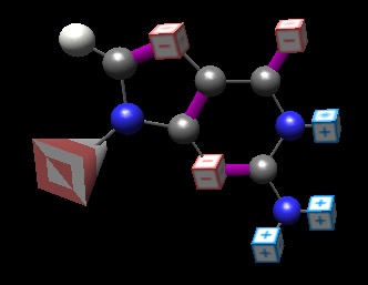
I think it’s a great crime that we even allow the single-letter abbreviation of the bases in Introductory Biology. In too many cases, students can successfully navigate a course by knowing that “A goes with T; G goes with C.”. Analyzing that presentation, the only ‘rule of pairing’ that I can derive is that the “pointier letters go with each other, and the smooth/curved letters go with each other.” While silly, I’m not sure that the student understanding must be much deeper. The only way we can help them go deeper is by making them look at and feel the basepairing faces of the nucleotides. But even here, classical representations fall short. I’m not even going to talk about stick figures; if we’re trying to get students to think about molecules as real, comprehensible, mentally manipulable critters, we should present them as solid things:
While this is the ‘correct’ display, wherein red carbon is gray, hydrogen white, oxygen blue and oxygen red (the pyramid is meant to indicate where the ‘bulk’ of the backbone would be emerging), this representation can be actively deceptive for a beginning student thinking about basepairing. Note that the hydrogens on the right are partially (+) in charge, whereas the one on the left is neutral–yet they are portrayed the same way. The oxygen and most of the nitrogens all possess the same partial (-) charge, but the former are red and the latter blue. Further, in terms of cytosine pairing with guanine, how are we to intuit that “red goes with some whites” and “white also goes with some blues”?
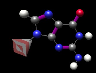
Molecule display of bases done better
The thinkBio BasePairer application allows students to interactively charge-label the atoms, producing figures such as this one:
Now we have a reasonable representation in that the charges are shown. No one can look at this molecule without wanting to create partners; the partner for the left ‘face’ must have charges (top to bottom) of (+), (-), (-) to complement what we have here. That prediction is born out for cytosine, readily ‘explaining’ the partnering of the two bases and creating meaning/understanding.
Less talk; more graphics
It fascinates me to see electronic biology textbooks resolutely refusing to take advantage of the medium. Most of the molecules discussed in Introductory Biology are made up of small numbers of atoms (sugars, bases, amino acids, lipids… even some proteins are not outlandish in size). There exist 3D rendering engines for molecule display that let students look at every such molecule in three dimensions; to rotate it, identify equally and unequally shared electrons and thus partial charges (as done above for BasePairer). Further interactivity, such as having alpha carbons or backbones of amino acids blink to help the user identify them are again easy. For proof-of-principle, check out thinkBio’s online StructViewer (Shockwave plug-in required)… and the ongoing small-molecule project.
In almost all cases, we want our students to look at the surface properties of the atoms and molecules they’re examining (more on redox and electron values coming up). Neither stick figures nor classical oxygen = red displays help them out here. Tragically, the charge convention used in Chemistry (and which I do think we’re obliged to adopt) uses two colors, red and blue, for a different purpose than the atomic designations for oxygen (red) and nitrogen (blue): they’re about charge. I’ve not figured out how to make this straightforward to think about so my students are forced to simply memorize the conventions. But the payoff is huge–the image below is a still of work done by Frieda Reichsman (she now works at Concord Consortium):
What to show in a molecule display
Atoms and bonds
Most of my students aren’t going on to become research biochemists. On this basis, I think it’s legitimate to balance ‘formally correct’ presentations with informationally rich ones. The ‘charge on the surface’ view above provides an intuitive representation of surface charge (well, once you get the blue/red thing into your head–still, it’s better than the actively confusing atom-coloration scheme, and the sticks-and-letters format). The ‘replace circles with cubes’ idea used in the BasePairer image above is unique as far as I know, but instantly tells students WHAT the charge is (+ and – signs on the cube faces) while subtly reinforcing the color scheme. A second possibility is shown below.
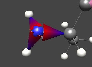
Above, the bond between atoms is instantly recognizable as asymmetric, and the ‘fat’ end is where the electrons tend to hang out. The red-blue gradient is present to reinforce the color scheme.
Electron ‘value’
I have ranted previously about how frustrating it is that textbook graphics rarely, if ever, display the electrons and their states that are the entire purpose of the TCA cycle and electron transport. While I’ll likely one day strangle someone for saying ‘high energy bonds’ with regard to ATP, I think it’s correct and very useful to use related terminology about electrons. The process of respiration takes ‘high value’ electrons harvested from glucose molecules and ‘exhausts’ them in the process of doing the work of creating a proton gradient. For this reason, I think it’s critical that we focus student attention on these electrons in a way that emphasizes their value and differences between them. The image below was created in collaboration with Hayden-McNeil publishing (to my deep regret, I don’t recall the artist).
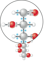
Shown is a molecule of glucose. I’ve reverted to the ‘classic atom color’ scheme because the state of the atoms themselves is not critical; it’s the electrons. We used blue in an effort to invoke a sense of electricity, but in retrospect, yellow would be a better choice both because we’ve got enough blues and reds running about in previous schemes, it corresponds directly to an intuitive link to electricity, and because high-value electrons (biologically speaking at least) are those that are equally shared between carbons and hydrogens–and hydrophobic regions of molecules are often shown as white or yellowish. Be that as it may, I believe that this form of representation has several advantages:
- The FACT that there are electrons in the molecule is emphasized. This is completely overlooked in formulaic (C6H12O6) or even stick figures
- The user is immediately drawn to the ‘hot blue’ electrons, and there is a contrast to the ‘dull gray’ ones
- The observant user will note that electrons that are ‘equally shared’ are blue; those toward the oxygens are dull–correctly reflecting extractable biological energy
- In further depictions, we can intuitively represent the ‘downfall’ of electrons–as they are brought to consecutively lower potential energies through electron transport, for example, they can be successively ‘dimmed’, providing a very satisfying representation of “what’s really going on”–a loss of electron potential energy in exchange for proton translocation.
Are there crimes here?
This posting is really about two things–suggesting that it’s high time textbooks and teaching materials reflected the ease with which more informative molecule display can be achieved, and suggesting a number of new ways that I think can enhance existing conventions. I’d like to point out how helpful the recent (at least by my observation) convention in biology textbooks of showing unequally shared electrons closer to the appropriate atom can be to students. While it, too, stretches the formal physical truth (electrons are not constrained to a hypothetical line between atoms), the bigger truth is thrown at the reader every time they look: electrons are sometimes differentially distributed. Since this has consequences for surface charge, it’s the foundation for comprehending water and basepairing and protein structure. I think the value far outweighs the oversimplification, and I don’t think it creates the kind of misconception that students won’t be able to get past as they pursue deeper and richer understandings of electrons and orbitals on up the line. Hopefully, the representations proposed above meet that same burden.
Further explorations
An extensive look at hemoglobin: principles of protein folding, how it works, how the structure allows pH response, fetal hemoglobin, sickle cell anemia, hemoglobinopathies.
Human genetic diseases: some examples and where the mutations are in 3D structure
…and more!