

I have been frustrated with challenges associated with sloppy student thinking on the one hand and the challenge of detecting/understanding student logic in verbal work on the other. I think the challenge is twofold: part is in finding ways to help them organize their thoughts (and create/detect organization); part is driving a ‘common language’ where the structure of their ideas stands out from the word-swamp that a lab report or textual description can be. In several classes, colleagues and I have used ‘logic diagrams’ and after climbing the learning curve, I think we see students achieving mastery resulting in better thinking, more insightful and well-organized final products, and quicker, easier grading–that directly addresses (our) assignment goals. Disclaimer: personal story, examples & perceptions, not studies, follow.
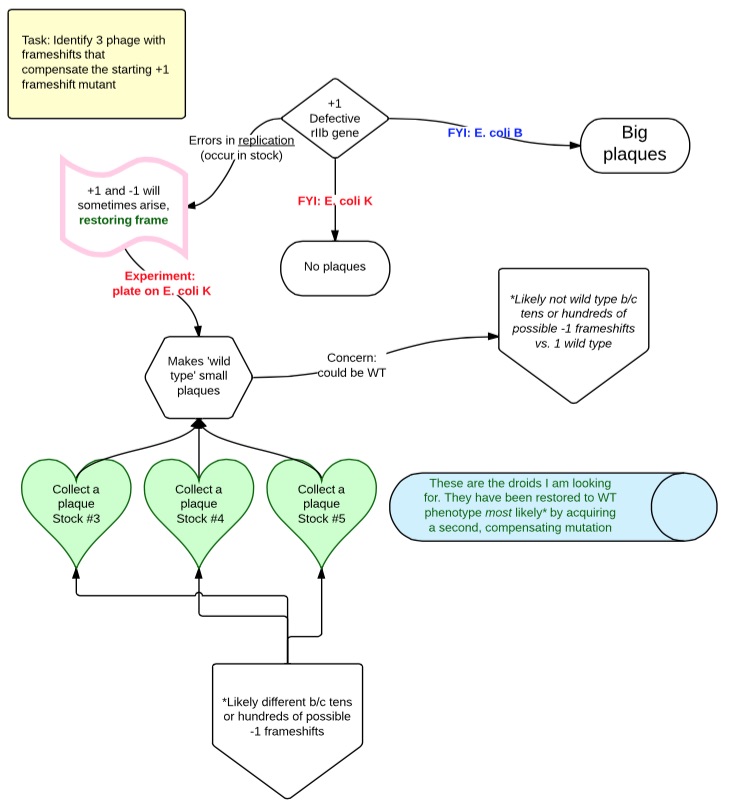
I want to start with an informal definition. ‘Logic diagrams’ are our (myself, some colleagues at U of AZ) implementation of visual, structured arguments and expositions that represent the flow of information, logic, or experimentation. The image at left shows an example from an early class assignment; a frivolous ‘how to detect a vampire’ can be seen here. I have received permission from several students to share work with redacted personal information; since these are derived from ongoing courses, please contact me via e-mail if you are an instructor looking for ‘real life’ examples.
FYI: the ones I post are generated using ‘LucidChart‘, which offers pretty extensive options for free, and even better ones for free if you’re a student with a .edu account. One could also use MindMapping applications, or even a drawing app, though the killer features here are
- A variety of readily available shapes
- option for real-time collaboration (drawing and exchange of text, but not voice messages)
- Good tutorial support
- ‘magic lines’ that maintain orderly linkages as shapes are moved around
- Ability to add text to shapes and joining lines
- easy export to .pdf (and other formats)
- ability to incorporate digital artwork from users or the web
- available for all browsers as well as dedicated app for iPad and (I think) android
The only downside is tables were a bit tricky and tedious to create; I would not know if this had been addressed recently. I’ve set up a page of the most critical how-tos here.
Logic Diagrams as tools for communication/Assessing
I’m going to spew generalities here, though they’re derived from my own experience. I think there are a lot of issues with giving students long reports, lab write-ups, or indeed any pure-text assignment for much of what I ask them to do. This is not a screed about student writing skills (though I do believe that enforcing a clean, visible organization on their work can have positive influences on writing). Instead, I think it’s a matter of focus and detection.
My background is primarily into Introductory Biology labs, where the classical approach was weekly full-blown lab reports. These can run 10-15 pages, and include demands of structure (Abstract, introduction, etc.), specific communicative elements (tables and graphs), ancillary items (captions, legends), and a minefield of formatting. All these have their place, but they’re a giant sideshow if our focus is on understanding the purpose of the experiment, the design and role of the controls, the interpretation of the results, the linking of a given conclusion to a series of observations, pre-existing knowledge, etc.
Benefits in quality of work/insights for students
The joy of Logic Diagrams is that they can be used to strip inquiry to the bare essentials: facts, observations, conclusions and the threads of logic that join them. If a student wants to claim that X follows from A and B, then this claim sits there starkly in front of them, with a clear indication of what support they are claiming. They can count the number of supports they are claiming for it, and see its place in the overall logical structure they are creating. It’s much easier to create a foggy paragraph where a conclusion magically appears in the tangled weeds of words than a rectangle+phrase arising from nothing. Thus the structure of the assignment organically forces student to the goals generally sought:
- be succinct (we have rules about the number of words that can be put into an element… but be careful here and make sure you’ve generated your own first; sometimes 12 words aren’t enough to say anything!)
- proceed in a logical fashion (while we see some bizarre linkages and structures, especially at first, the bizarreness is at least revealed clearly for all to see!)
- be clear about where your conclusions are coming from (in a written report, things can appear in a conclusion section for the first time; in a diagram, they ought to come FROM something)
- don’t bring things out of nowhere (if they don’t fit in the diagram, do they belong at all?)
Logic diagrams and ease of grading
Let me start by saying that bad logic diagrams are just as much of a hot mess as a horribly written lab report. Not everyone will feel compelled to make lines and shapes mean anything; words and ideas can be plopped down randomly. That said, with guidance + examples, a round of practice (or two…), and a commitment, the outcome can be liberating for the person at the assessment end of the task. Want to find the key idea? There are relatively few words on the document, and the structure itself should give a good indication: where do all the lines go or where does the flow lead? Want to know where an idea or result came from? Unlike a text document, where there is no visual cue at all, with logic diagrams, just look for the lines leading in. It may be a reflection of the unique workings (or failings) of my brain, but I can much more quickly assess both the details and generalities of a presentation when I can see it presented as geometries and linkages. I think more student effort is devoted to my goals for the assignment (doing good thinking, organizing and thinking about that thinking [metacognition], figuring out what really went on in an experiment, deduction, idea…). And I waste less time trying to understand why they did what they did (or even… what they did!). And it can work. In my final iteration of an upper division Genetics class, I thought students were all quite capable of a minimal standard once we got up and running, and some work was fantastic.
So if you want better focus on the ideas and more thoughtful work from students and are willing to spend less time grading to get it, I recommend you give Logic Diagrams some serious consideration!
I am not alone
Of course, it’s quite possible that I am behind the times; don’t let me claim otherwise. Anyway, there’s a whole course at Princeton based around their efforts in these directions. Unfortunately (from my point of view) it’s in the Philosophy Dept. rather than in science, but we can always point students in that direction. A brief video explains some of their thinking and success.